Time dependent variables are easily visualized by drawing their time series representation on a plot with time as the X-coordinate and the variable in the Y-coordinate. The challenge becomes visualizing two time series corresponding to two variables to study their behavior over the same X-Y plot. This short article presents a workflow for producing insights into the trend over time of two matching time series using animation to represent the passage of time.
The data set called economics from the ggplot2 package, has employment statistics on the US measured over the last 40 years up until 2015.
Here is a brief look at the first 5 out of 574 rows of the dataframe economics.
data <-head(economics, n=5)knitr::kable(data)
date
pce
pop
psavert
uempmed
unemploy
1967-07-01
506.7
198712
12.6
4.5
2944
1967-08-01
509.8
198911
12.6
4.7
2945
1967-09-01
515.6
199113
11.9
4.6
2958
1967-10-01
512.2
199311
12.9
4.9
3143
1967-11-01
517.4
199498
12.8
4.7
3066
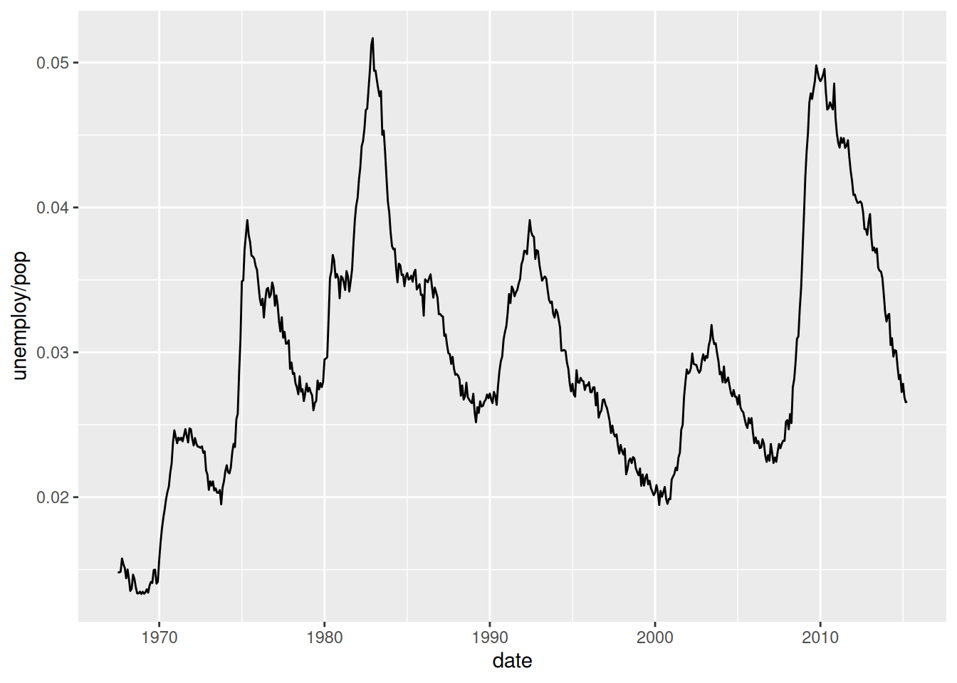
Visualizing the Unemployment Rate
Let’s first make a simple time series plot of the unemployment rate. This is a continuous variable that is computed with the ratio unemploy / pop.
In ggplot2 a frame defines the first mapping from variables to a space where the data will be represented. It is created with the function aes(). The obvious frame for this plot is defined by the two variables date and unemploy / pop. They are mapped to the x and y coordinates of a 2-D plane. The glyphs drawn over this frame will be lines between the data points located in the frame, they are created with the function geom_line(). This function defines a layer over the frame.
Technically speaking unemploy / pop represents the “population rate of unemployment as a fraction of the population able to work that is unemployed”, (https://www.bls.gov/cps/cps_htgm.htm#definitions)
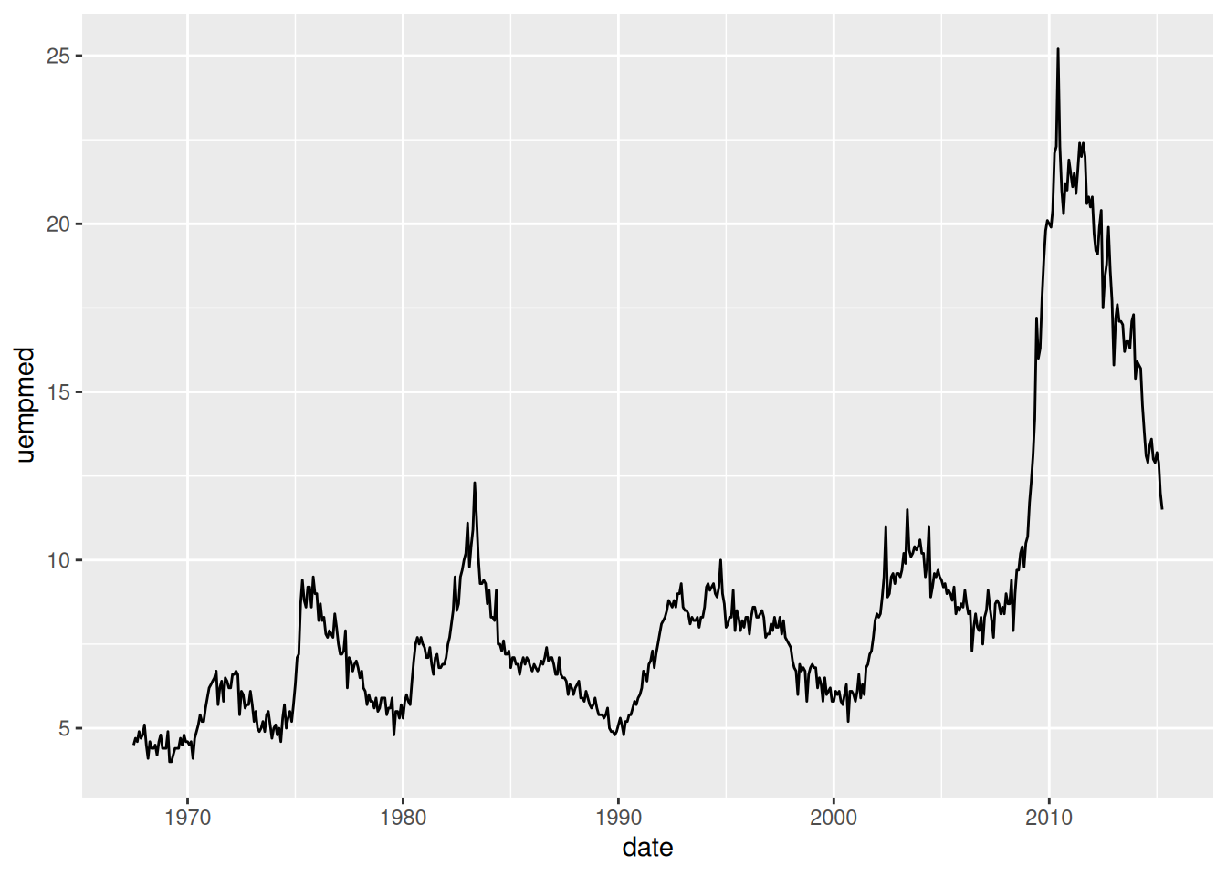
Visualizing the unemployment median duration in weeks
Another variable called uempmed from the same dataset tracks the median length of time in weeks of unemployment.
From these two plots one can observe the recent trend towards longer median unemployment time in the decade of 2010. There are also cycles of between 5 and 10 years of peak unemployment rates.
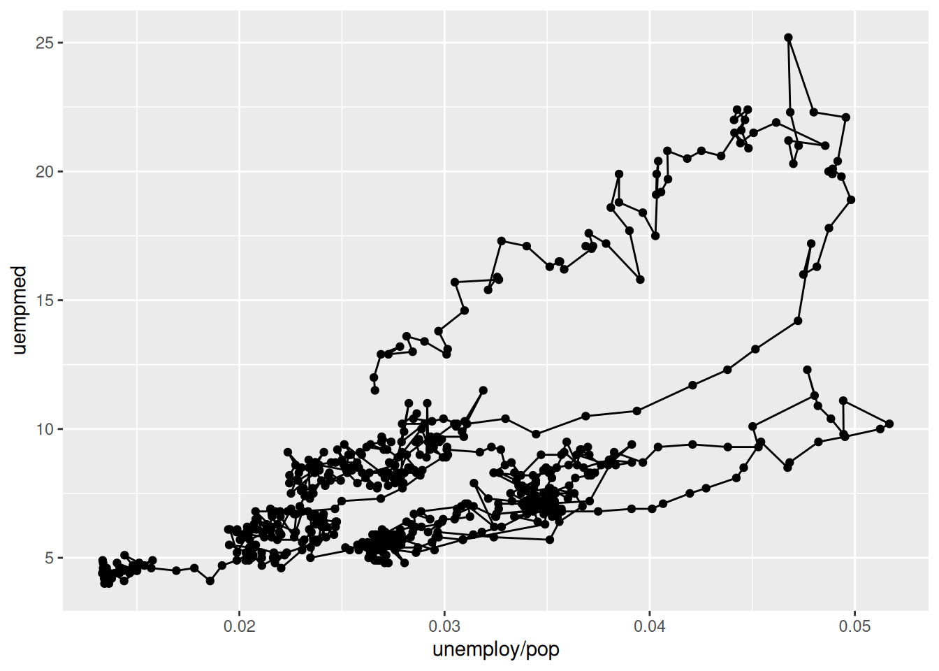
An interesting question is how these two time series correlate over time. Are there interactions between these two variables that we could observe in one plot?
Visualizing both variables in the same plot
In ggplot2, the frame for a representation that shows both variables on an line plot can be defined by a mapping of each variable to the x and y coordinates of the plane. We can create two types of glyphs over it: one is points shown by a layer defined by geom_point to show the location of the variables at a point in time. The other type of glyph is lines to show the sequential trajectory, ordered by time, from one point to the next. This is captured by the layer geom_path. The figure below shows such a graph.
It is hard to understand the direction of time from the lines alone. For example, it is difficult to visualize where the first, the last, or any years in between have happened.
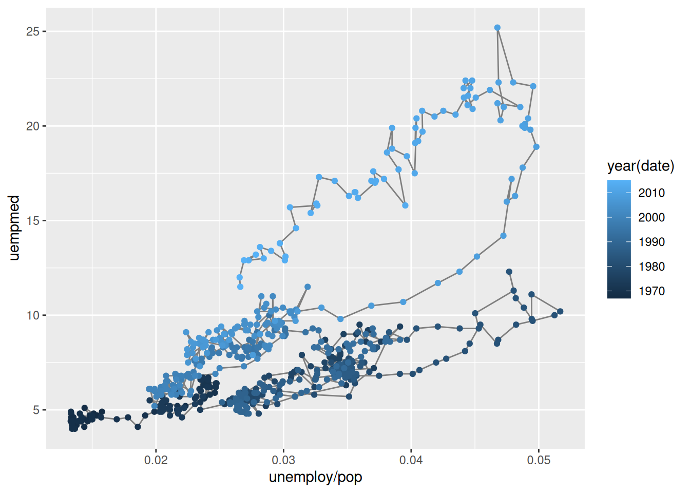
This can be addressed by adding a mapping from the property colour to the variable year in the layer geom_point. R uses a default colour scale to assign specific colours from a colour palette to years.
The ggplot2 package defines the function aes() to create this many to many mapping.
The layer geom_path has a mapping from each line created between points to the same colour value indicated by the specification “grey50”. The syntax does not require the use of the aes() function. It is a many to one mapping.
This plot is a good attempt at representing the time dimension with a varying shade of colour. This solution is not entirely satisfactory because the lines get too entangled making the progress of time confusing in some quadrants.
Animation to the rescue
We can get a more sophisticated visualization by using animation to explain how the two variables change simultaneously as time passes. In the following plot, the values of unemployment rate and median unemployment length in weeks are displayed for every year. By pressing the PLAY button, one sees the points for each year over the line trajectory, from beginning to end. One can use the slider to visualize the position of the variables for any given year.
From watching the motion of the annual data after pressing the Play button, one gets the sense that for the first 41 years the values of these two time series remained within the quadrant below the 15 week and to the left of 4% unemployment rate except for the years 1982 and 83. Then after 2009 the median unemployment length in weeks has increased over and above any value of the previous years in the USA according to this dataset.
The animation has achieved the introduction of a new dimension to represent the flow of time over the bi-dimensional plane representing the two time observed variables. In non-digital media the only alternative we would have is representing time progression with other dimensions like point color intensity or perhaps point diameter.